User guide
Where a child grows up shapes how far they climb, and a family's wealth tells more of that story than its income alone. The Economic Mobility Explorer maps both, county by county, for every U.S. county with data. This guide walks through every panel and interaction so you can get the most out of the tool.
Orientation
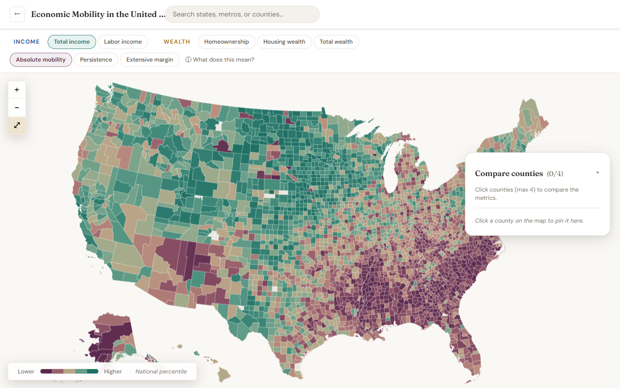
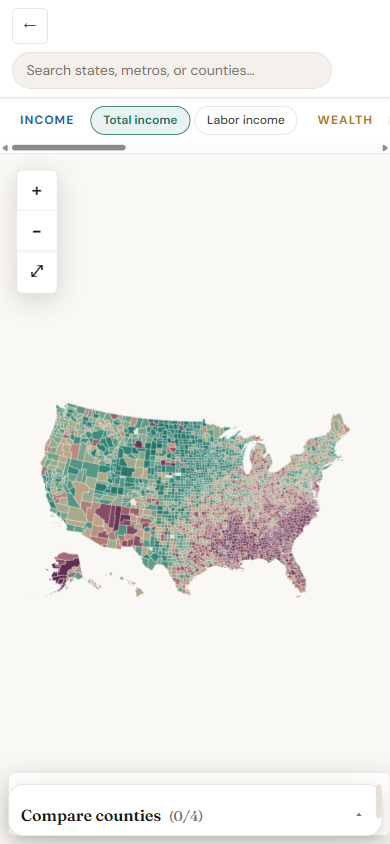
The Explorer is a single full-screen page built around the national county map. Around the map you'll find:
- Top bar — left to right: a ← button back to the landing page, the title Economic Mobility in the United States, a wide search box for states, metros, and counties, an Explorer user guide link with a book icon, and a Learn more about this project pill.
- Focus sub-row — appears under the top bar only when a state or metro is focused. Shows the focused place name with a × to clear it; on a major metro it also shows a View report ↗ link to the shareable report page.
- Metric strip — five economic concepts split into Income and Wealth, plus three measure types (Absolute mobility, Persistence, Extensive margin). The active selections drive the map color.
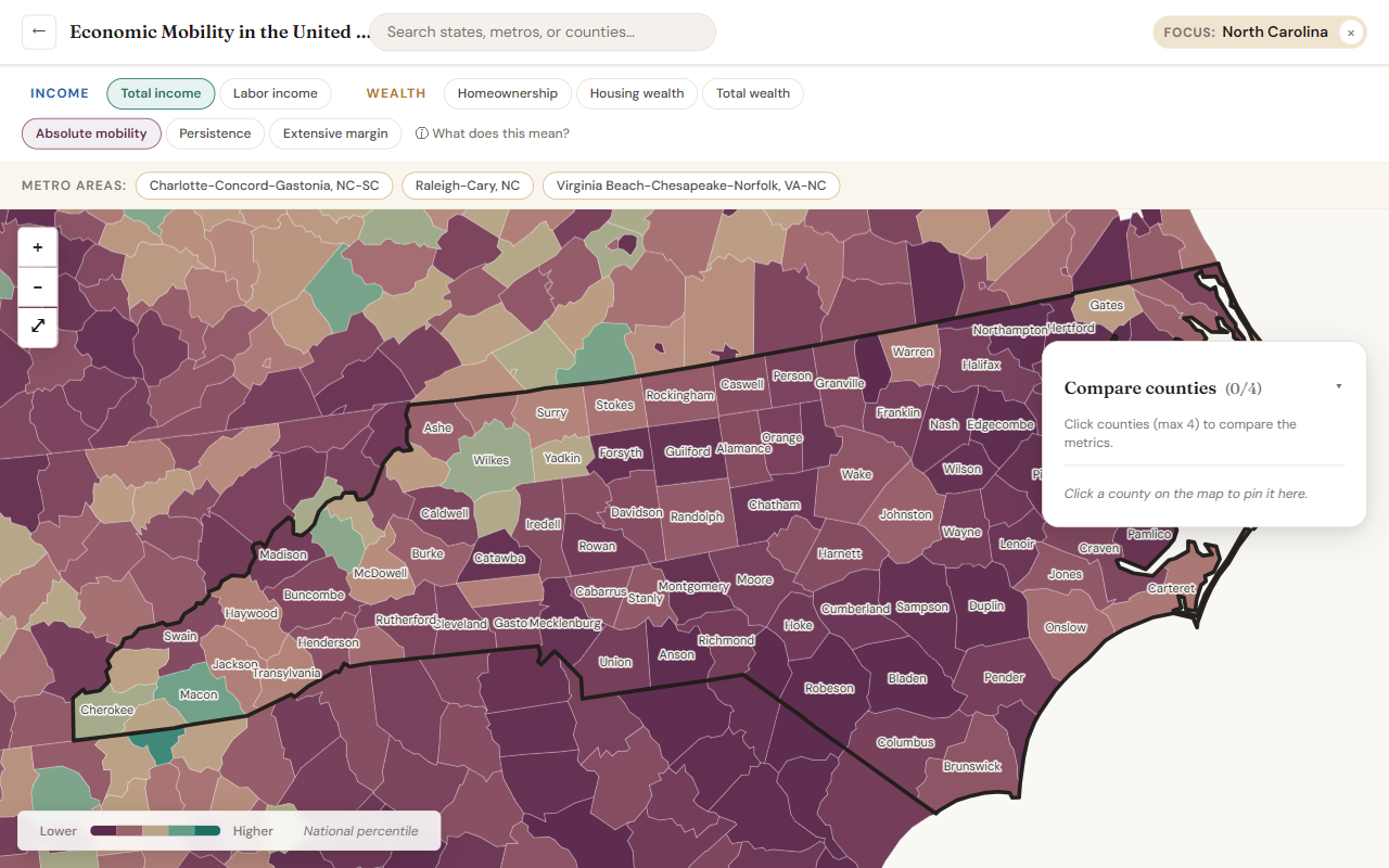
- Metro buttons — appears when you focus on a state; lists the major metropolitan areas (population ≥ 1 million) in or near that state, alphabetically.
- Map area — the choropleth and overlays. Top-left has the zoom controls (+ / − / reset-to-national). Bottom-left shows the color legend.
- Compare counties panel — a floating card on the right that holds up to four pinned counties.
Choosing a metric
A metric is the combination of one concept (what's measured) and one measure type (how it's summarized).
- Concepts: Total Income · Labor Income · Homeownership · Housing Wealth · Total Wealth. The two income concepts are grouped under Income; the three wealth concepts under Wealth.
- Measure types:
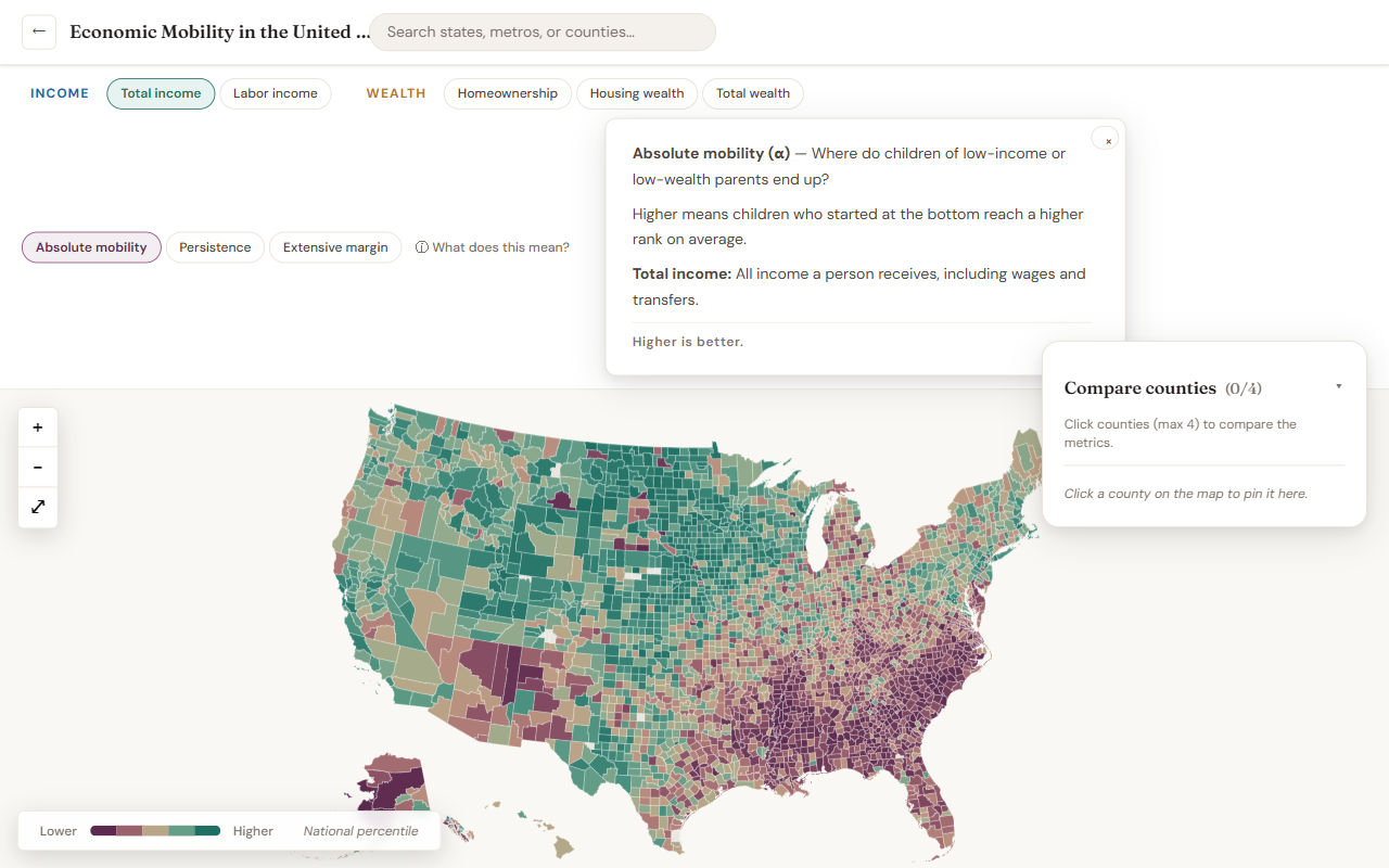
- Absolute mobility (α) — the average adult rank of children whose parents were at the bottom of the distribution. Higher is better.
- Persistence (β) — how strongly a parent's rank carries forward to a child's rank. Higher means less mobility.
- Extensive margin (δ) — the extra penalty for children of parents who had none of a resource (e.g., renters for housing concepts). Higher means a larger penalty.
- Need a plain-language reminder of what these mean while you explore? Hover over the ⓘ What does this mean? button at the right of the measure-type row to peek at the explanation; click it to pin the explainer open. Close it with the × in the corner.
Reading the map
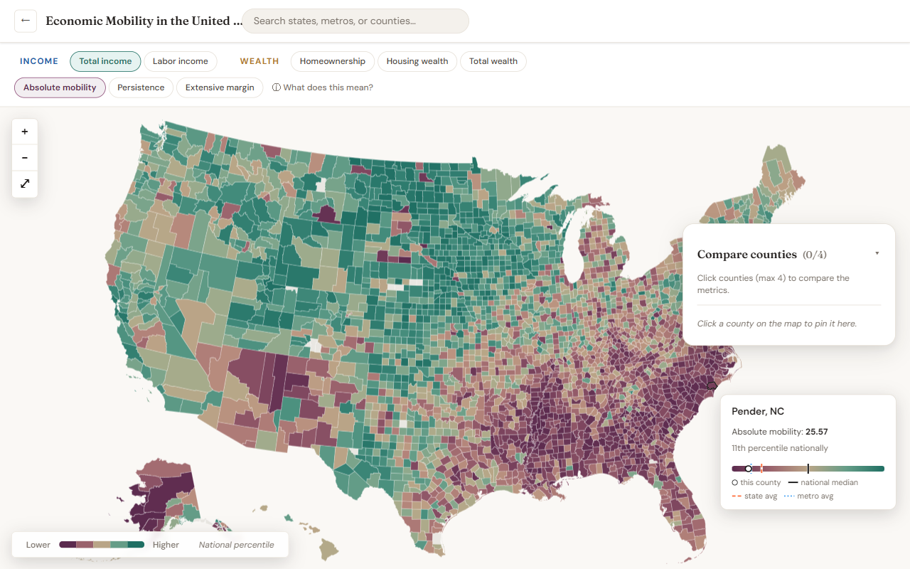
Every county is colored by its position on the national distribution for the selected metric — not its raw value. Counties in the no-data gray either fall outside the underlying dataset or have no reportable estimate for that measure.
The legend (bottom-left) shows the color ramp and the good/bad direction:
- For Absolute mobility (α) and Extensive margin (δ): Higher percentile = better outcome (teal-green end).
- For Persistence (β): the direction is inverted — the teal end means less persistence (more mobility), the plum end more persistence.
Hover tooltip & distribution strip
Move your cursor over any county to see a small tooltip with:
- The county name and state.
- The current metric and its raw value.
- The county's percentile rank on the national distribution.
- A small horizontal distribution strip showing the county's place on that distribution. The strip uses the same color ramp as the map.
Three reference markers cross the strip, each in a distinct color and pattern:
- This county — a white dot ringed in black, marking the county under your cursor.
- National median — a solid black line at the 50th percentile.
- State average — an orange dashed line, the average percentile across all counties in the same state.
- Metro average — a blue dotted line, the average percentile across all counties in the same metro area (shown only when the county is in a CBSA).
Searching for a place
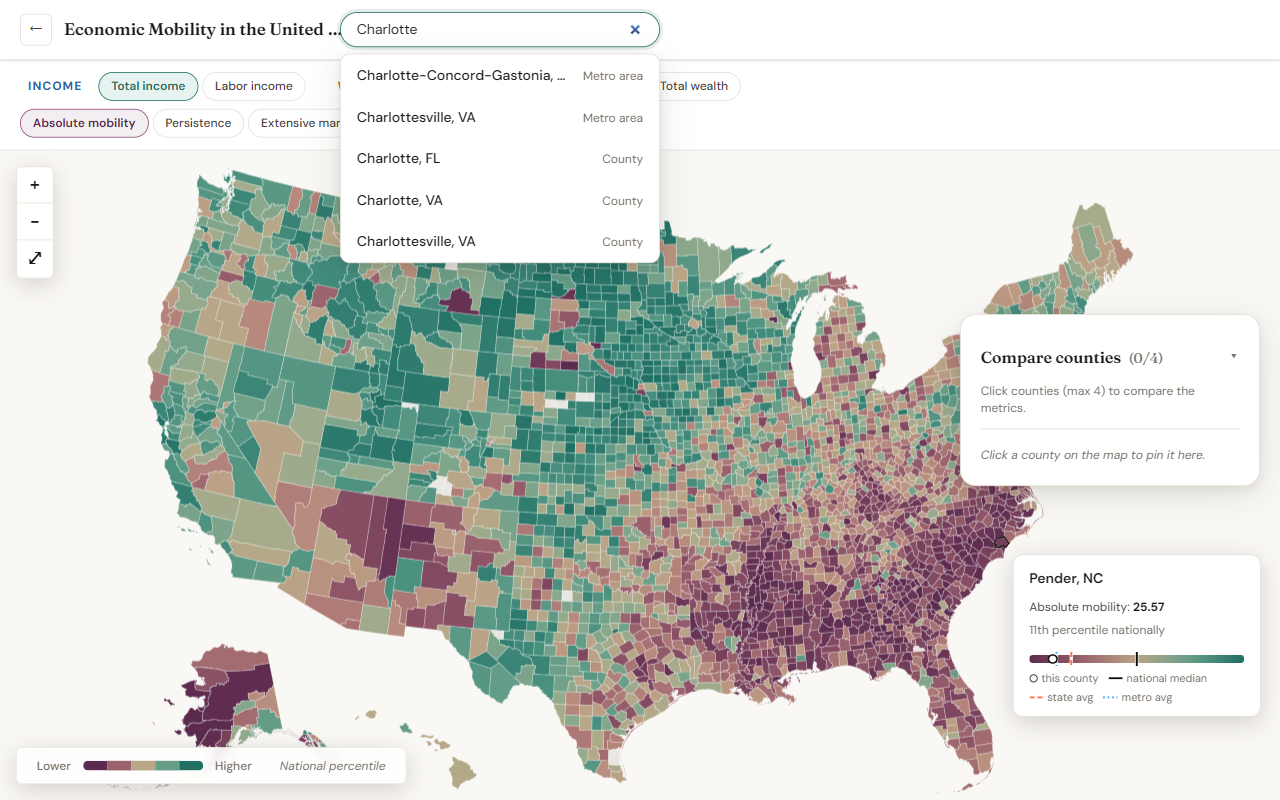
The search box at the top matches against states, metro areas, and counties simultaneously. Start typing a name and pick a result:
- Picking a state sets the focus to that state — the map zooms to fit it, the boundary appears, and the metro buttons appear for the major metros in or near that state.
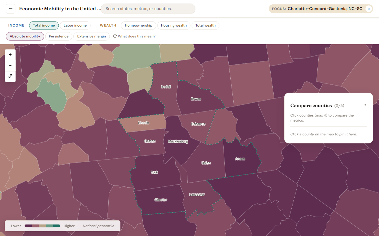
- Picking a metro zooms to that metro's county footprint and draws a dotted metro boundary.
- Picking a county focuses its state, zooms there, and pins the county into the Compare panel.
- Press Enter in the search box to re-zoom to whatever's in the box — useful if you've zoomed out and want to snap back to the active place.
Zooming and panning
You can navigate the map four ways:
- Scroll wheel / trackpad — zoom toward the cursor.
- Click and drag — pan the map.
- Zoom controls (top-left of the map): + zoom in, − zoom out, ⤢ reset to the national view.
- Search and click a state, metro, or county — the map fits that region automatically.
On touch devices, one-finger drag pans and two-finger pinch zooms. The same + / − / reset buttons work on touch as on desktop.
As you zoom in on a state or metro, county labels appear (without the redundant "County / Parish / Borough" suffix). Labels only show up when the county is large enough on screen to read comfortably.
State and metro focus
When a state or metro is focused, a thin sub-row appears under the top bar showing Focused on [place name] with a × to clear it. For major metros, this sub-row also shows a View report ↗ link to the shareable metro report (see the next section).
While focused:
- The map is zoomed and centered on that area.
- For a state, a thin dark boundary outlines the state.
- For a metro, a thin dotted teal boundary outlines the CBSA.
- The metro buttons (state focus) or county labels (deeper zoom) help you navigate further.
To clear the focus, click the × on the focus chip or the reset (⤢) button on the map.
Comparing counties
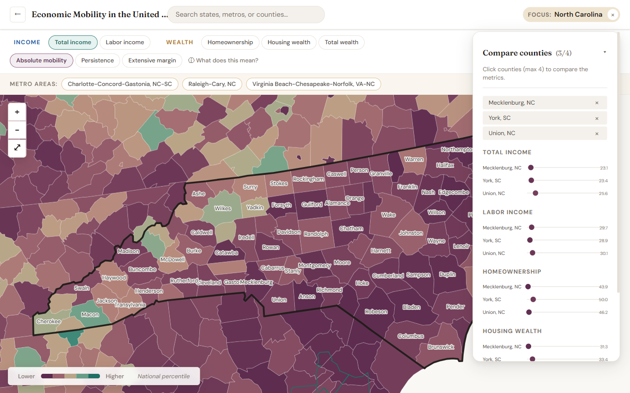
The Compare counties panel sits on the right of the map. Click counties on the map to pin them (maximum four at a time). For each of the five concepts, the panel shows a small dumbbell chart with every pinned county's position on the national distribution. For example: a county might score in the 80th percentile on income mobility but the 40th on wealth mobility.
- Click a county on the map to add it.
- Click the × next to a county's name in the panel to remove it.
- Switching the measure type (α / β / δ) updates all the dumbbells together.
- Counties are labeled Name, State (e.g., Mecklenburg, NC) so you don't confuse counties of the same name across states.
Metro reports
Every major U.S. metro area (population ≥ 1 million) has a shareable report page at /metro/<cbsa-id>-<name>. These pages stand on their
own outside the explorer: each has its own URL and social-media preview
card, and reads well on a phone or in a printout.
To open a metro's report:
- Focus the metro (search, pick from the metro buttons, or click it on the map), then click View report ↗ in the focus sub-row. The report opens in a new tab so you don't lose your place in the explorer.
- Or visit the URL directly.
/metro/16740redirects to/metro/16740-charlotte-concord-gastonia, so both old and new shares work.
Each report page has:
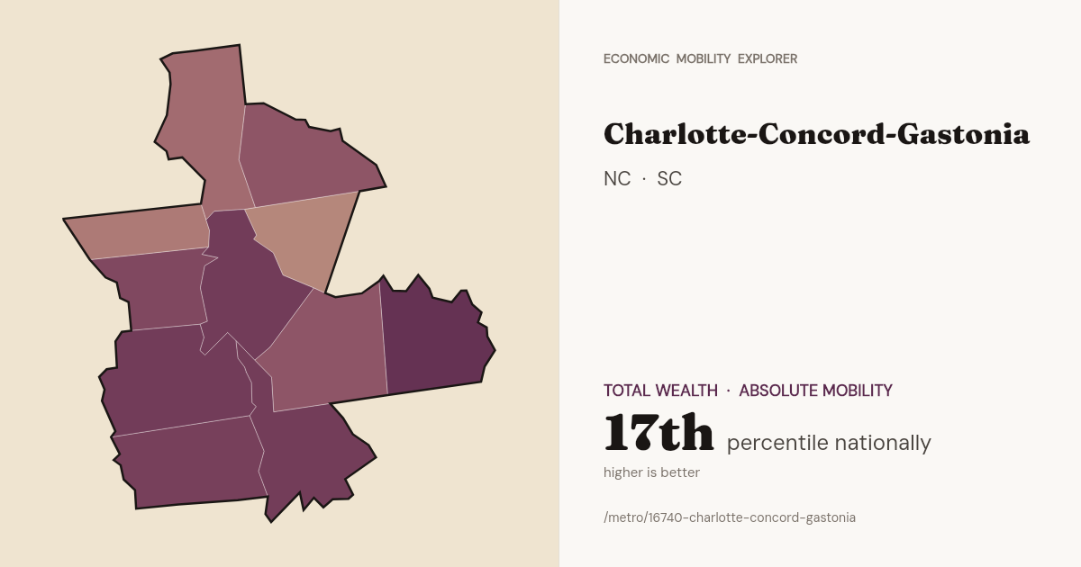
- A hero with the metro name, the states it spans, its population, and a headline metric callout showing the metro's standing on the national distribution for total-wealth absolute mobility ("Charlotte-Concord-Gastonia: 17th percentile nationally").
- Share buttons for Facebook, LinkedIn, X, a Copy-link, and the native share sheet on mobile. Posting the URL anywhere triggers a 1200×630 preview card with the metro's county-level choropleth on the left and its name + headline metric on the right.
- A map snapshot showing the metro's counties as a small choropleth, with each county labeled.
- The five lenses at a glance — one card per concept (Total Income, Labor Income, Homeownership, Housing Wealth, Total Wealth), each showing all three measures (α, β, δ) as percentile strips with the metro's aggregate value.
- A constituent counties table with the raw α / β / δ for the selected concept, plus the sample size for each.
- An About the data footnote linking back to the methodology and the NBER working paper.
Sharing what you see
The URL updates as you interact — selected metric, focused state/metro, and pinned counties are all encoded in the query string. Copy the URL to share the exact view you're looking at; opening it again restores the same state.
For shareable per-metro pages with social-media preview cards, see Metro reports above.
Caveats
- All values are small-area (Fay–Herriot) estimates; small or sparsely-sampled counties carry more uncertainty than the headline color suggests. Read the Data section for details.
- The map covers the 50 states plus DC. Territories (Puerto Rico, etc.) are not present in the dataset.
- Metro classifications use the latest OMB CBSA delineation; the Metro areas strip is filtered to major metros (population ≥ 1 million) to keep it compact. All metros remain searchable.
- Metro aggregates in the Compare panel are population-weighted means of constituent county estimates.